“We really wanted Jonathan’s new portfolio to fit seamlessly into the brand. The work coming out of JCP feels so natural, honest and beautifully crafted—that’s how it needs to be presented. Our suggestion was to find a solution within the heritage realm—an object that feels like it could have been made by one of Jonathan’s photo subjects. We began compiling items of handcrafted inspiration made of felt and leather with thoughtful details like hand stitching. From there, Travis Read took those ideas and sketched out a great piece with just the right character and utility. We love it!” Nathan Strandberg, Eight Hour Day
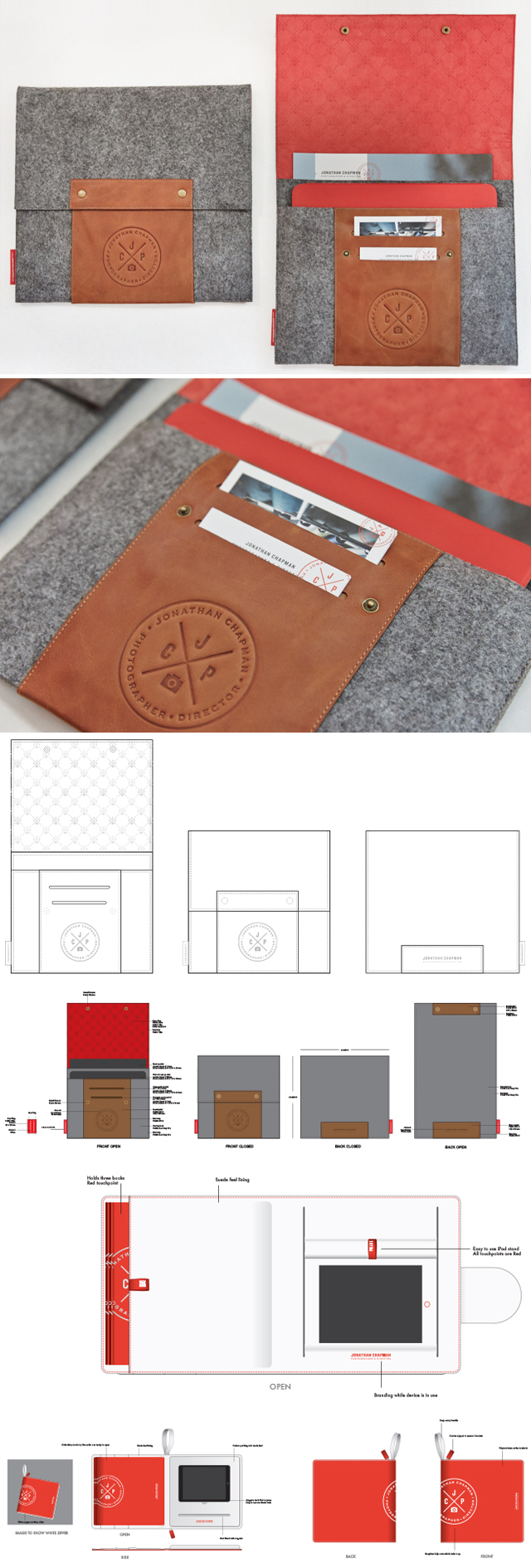
The era of all things digital seems to be pushing the print portfolio slowly out the door. We put our heads together to revisit the idea of a portfolio; one that retains the tactile beauty of a print portfolio (case, design, and a physical book) as well something that allows seamless integration of the iPad, showcasing the film side of our work. We coordinated some initial meetings to bounce ideas off graphic designer Nathan Strandberg from Eight Hour Day and industrial designer Travis Read, both creatives doing amazing work that we have had the chance to partner with on several occasions in past years. We went through many rounds and incarnations of case designs that could house an iPad for our video content, as well as hold our printed portfolio, business cards and smaller promo samples. You'll see many case designs and the overall evolution presented in the imagery above.
The new portfolio case is hitting the streets nationwide and we are excited to share what came to life after several months of discussion and prototypes. After finishing the portfolio we circled back with Industrial Designer Travis Read for his take on the project through a short Q & A:
From initial concept to final product and every step in between what was the continued inspiration or drive for the project?
From the beginning of the Project, I knew that I wanted to make a custom form factor for the case that would address the unique needs of the end user. There are plenty of cool looking cases in the market place, but non of the cases adequately addressed the need for this type of functionality. Understanding the end user was my biggest driver. At first, I went over board with the functionality and didn't focus on the style of the case enough. But as I learned more about the end user's role as a creative director, the style and simplicity became equally important. It took some time to find the balance, but I think we finally found the balance with our final case.
What is one part of the final portfolio that really stands out in your mind?
The leather band really brings the whole piece together. It creates the necessary color accent, the heat pressed logo is beautifully burned into the material and the integrated card pockets show that its functional and not just wasted material.
Was it a challenge to match functionality with the aesthetic of the design? How did you bring these together?
It was a challenge, I hate unnecessary accents, we see this all the time on clothing and bags. Every piece on the JCP iPad case is purposeful, minimal and designed to create the right look. It utilizes grey felt and real leather, to give it an authentic look that is on trend. The large flap and pockets neatly organize the system, so that it looks clean and easy for a first time user to open and pull out the contents they need.
As an industrial designer, is there anything else you would like to add?
I've made a lot of products for retail customers over the years. This was an interesting project, because we were focused on a specific user segment and not trying to make some generic enough for the masses. We conceptualized all kinds of ideas that would never work for mass market, but would be fantastic for a small amount of people. It was also really nice to work with creative people that are in a very different field than hardware development.


