Close Map X

JCP Travel Map

Explore the work of Jonathan Chapman through featured locations.

United Way

TV Spot:

Behind the Scenes Video: -->
The name has changed several times since 1887, but the idea of fundraising and giving has remained the same all along for the United Way of America.  Through these efforts, they have been able to focus on select issues in diverse communities reaching into the areas of education, income, and health to name a few.

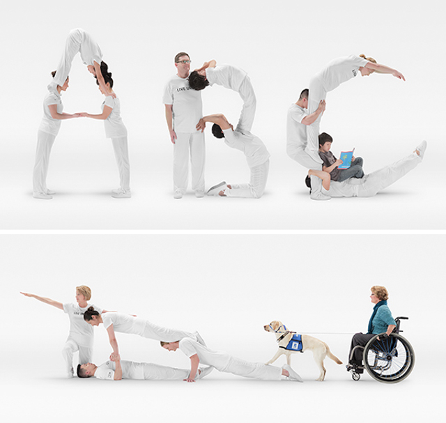
Earlier this Spring we were brought in on a still and motion project by Campbell Mithun to help create visuals for the 2012 United Way campaign "Live United."  We worked closely with the agency to refine the approach involving the talented performers at Circus Juventas in partnership with the United Way.  From the beginning the concepts were very literal in representing the ways in which the United Way helps out in the community.  The instructors at Circus Juventas provided us with their flexibility and strength to form and hold the shapes of the "A, B, C's," an outline of a house and even a ramp to help illustrate their commitment and involvement.  The final creative utilized the stills and video we created to help promote the collaborative nature of  the United Way and the great work they continue to do in the community.

This was an exciting project on a number of levels.  Shooting took place over two days, one week apart.  This added some challenges as far as time required to build and strike our set.  Lighting the scene, on location at Circus Juventas, required the combining of two 12' seamless backdrops as well as an elaborate lighting rigging, designed and engineered by local gaffer, Dave Underhill.  As this was a still + motion based shoot we used continuous lighting vs. strobe.  Motion visuals were shot on the Canon C300 which proved an amazing camera for it's low light shooting abilities for both standard + slow motion capture.

Above are the outdoor, billboard visuals, the finished :30 tv spot, and be sure to check out a behind the scenes video of the production created by the internal video team at Campbell Mithun.

“I’m Lovin’ It” - Shanghai, China Vol. 2

Following up on last month's still image post, we are excited to debut the motion edit "Smile."   Produced for McDonald's in Shanghai, China, "Smile" offers a glimpse into the broad palette of sights, sounds, people and places at the second of four international cities during last November's 2 1/2 week tour.

Our 6 day visit had us traveling to a wide variety of restaurants, both inner city or central to Shanghai as well as on the outskirts of what seemed like suburban settings.  The pace and schedule left little time to ponder feeling jet-lagged.  Our two bilingual production assistants kept us moving and were invaluable when negotiating transportation and more importantly, interacting with employees and customers.  We did our best to learn a few essential words and phrases such as thank-you "謝謝," pronounced 'sheh she."  When speaking, we found a fast mumbled approach proved more effective and easier for natives to understand than belaboring perfect enunciation.   This quick phrase method also seemed to match and keep pace with the energy of the people and our surroundings.

With a population of over 23 million people and nearly three times the size of New York City, Shanghai proved time and again to be a metropolis of great depth, in which we only scratched the surface of during our short time there.  Even now, months after our visit we still talk about the experiences we had there and the lasting impression it has made upon us.  We welcome the opportunity to return and explore more of the city someday.

Edited by our close partners at Coelement, this project took a new turn at the final stage in terms of color correction.  The color / contrast treatment of all visuals, whether stills or motion is a big part of the final product we deliver.  Adobe recently launched Lightroom 4 and one of the more interesting upgrades is the ability to color correct motion clips in a fashion similar to our workflow when finessing the look and feel of the still images.  The ability to work on and affect specific colors, highlights and shadows, as well as provide a uniform, custom color palette is something we've grown to rely on from this software.  While there are still a few bugs to work out and the process needs some refining, having these color enhancing tools available for motion clips is really quite amazing.  Visit this link to see a side by side, before and after comparison.

Enjoy the final edit.  We've been keeping busy on several fronts with recent travel to Las Vegas as well as a few projects that could have us hitting several stops on the west coast in days ahead.

Genesis10 - The Next Level…


Design & branding agency Very Inc. reached out earlier this year to commission a custom library of imagery; a brand refresh they were working on for New York based Genesis10.  Established in 1999 and growing at a rate of over 30% each year, Genesis10 has established itself as one of the country's premiere management consulting companies.

Soon after the initial call, we began discussing the desired look and feel; how we could set our visuals apart from stock imagery that often accompanies the branding of businesses such as this.  The shoot comprised of talent taking the role of Genesis10 consultants interacting in a variety of office settings.

The creatives at Very were great to partner with at every step.  On the day of production they were collaborative and really trusted our instincts and suggestions to shape the look and feel of each scene.  It's always a refreshing challenge to build a library from scratch; an entirely different experience than shooting a few images to add to a preexisting body of work.  Having the freedom to roam amid a space with great lines, light, and talent that requires a subtle direction provided all the elements necessary to tie together another successful production.

St. Elizabeth Healthcare - Director’s Cut

While it seems like just a few months back it was just over a year ago that we were in full production mode collaborating with Intrinzic shooting five unique broadcast spots for St. Elizabeth Healthcare.  The project was one of our first forays into the world of shooting motion for broadcast.  The week long shoot had us juggling numerous indoor, outdoor, urban and rural locations in and around the greater Cincinnati area.

Cincinnati based Red Echo Post handled all the editing and finishing for the project crafting each of the five spots from the footage captured.  For televised air time, each of the five spots was limited to thirty seconds, which left many of our shots / sequences "on the cutting room floor," as they say.

After the project wrapped Tate Webb, the project's main editor at Red Echo, approached us with an offer to cut a longer director's cut that would highlight many of the shots that didn't make the .30 edits.  This was an exciting call to get as it meant we'd now have a chance to see a version that wasn't as confined in terms of time as well as the client's need to hear / see specific shots.

Enjoy the final St. Elizabeth Healthcare, Director's Cut.  A little slice of our favorite visuals from this broadcast production.

The Pines - Music Video Preview

All the waves crash over me
I was lost but I was free
All the while

- The Pines


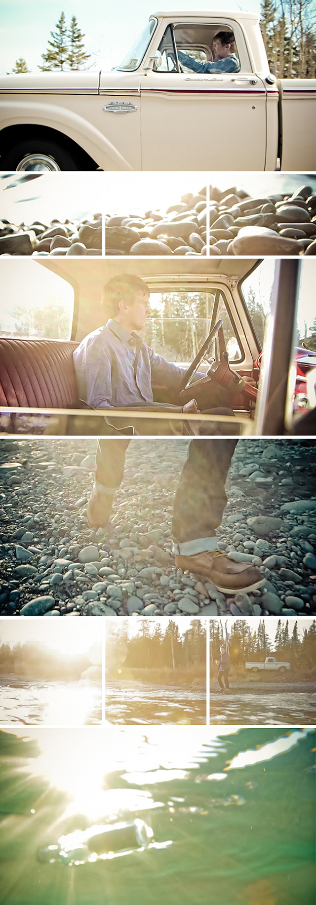
The visuals above offer an early glimpse into one of our latest motion collaborations.  We're stoked to be partnering with The Pines, producing the official video for All The While, a track from their latest album Dark So Gold.

Discussions began with The Pines while they were touring the east coast this past spring.  When we first made contact they were actually in New York City opening for Mason Jennings.  The Pines are described by RollingStone senior writer David Fricke as,"quietly gripping" stark-country. 

All The While and it's dreamlike narration felt like a logical track to accompany the storyline and visuals we captured along the shores of Lake Superior earlier this spring.  With insightful suggestions from The Pines' frontmen Benson Ramsey and David Huckfelt, we are quickly approaching final picture lock with color grading to follow in the very near future.    

Keeping true to all of our projects, this has been a very collaborative piece.  Eric Schleicher FilmerKid has been at the helm as our editor; tailoring the visuals with the pacing of the song.  Eric collaborated closely both at the project inception as well as shooting as our second camera on our day of production.  Tony Franklin and T.C. Worley of Royal Antler were close partners in story development from the early stages as well as offering production support, and camera work the day of our shoot.  John Fontana captured location audio as well as sourced additional clothing and accessories from the men's boutique Martin Patrick 3 MP3.  

There were many layers of partnership with creatives and businesses.  This collaboration always proves to be fruitful and rewarding on many levels, often inspiring additional project ideas and future collaboration.

Check in with us soon for the launch of the music video "All The While," by The Pines.  For now take a moment to enjoy a few still images that offer a little hint of what's to come...

“I’m Lovin’ It” - Shanghai, China Vol. 1

“No one realizes how beautiful it is to travel until he comes home and rests his head on his old, familiar pillow.” – Lin Yutang

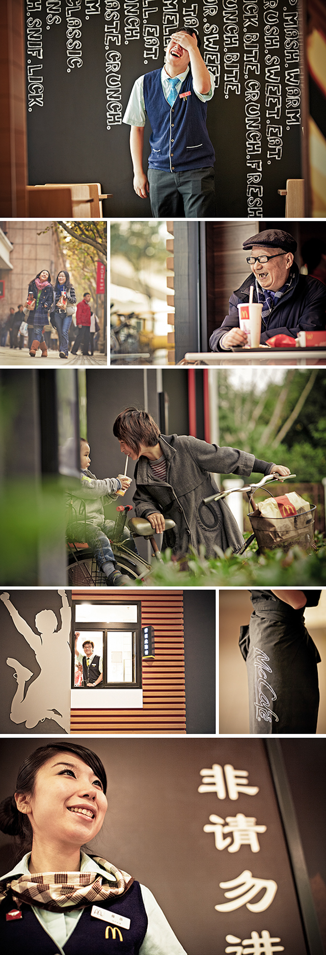
While the necessities of international travel such as passports, visas, and carnet forms, seem long behind us the images resulting from our week long shoot in Shanghai, China continue to stir in our minds and circulate some unforgettable memories.  Getting a call to produce a project of this size, scope, and distance away from home couldn't have been more exciting.

The 2 1/2 week tour began in Montreal, Canada and then routed us to Chicago where we boarded a direct flight to Shanghai, China.  Nearly fifteen hours later we arrived in a place just a month before we had no idea we would be venturing to.  Exhaustion from travel turned to elation upon boarding our taxi with all our gear having safely made the voyage.  Inside our taxi, a late model Buick with white gloved driver, we slowly crept into this legendary city with a population of over 23 million. 

Shanghai is a complicated mix of old and new happening simultaneously.  The skyline along the Bund is well known and even more impressive in person than reading or seeing it in printed form.  The modern skyscrapers shooting up to dizzying heights are visible evidence of the progress happening in Shanghai while the older iconic sections of the city seem a little more hidden and understated, although no less important.  This shift from old to new is happening at a very fast rate in China as a whole with the continued progress and success of Shanghai as a shining star at center stage.

Although our time was brief, we did have a chance to familiarize ourselves with a little of the old and the new in the largest city in the world.  The project for McDonald's involved capturing stills and motion, working with real people in fully operational restaurants.  Shooting took us to the hustle and bustle of the inner city as well as to the suburbs nearly two hours outside of central Shanghai.  Working with the support of two local bilingual PA's we were fully immersed and felt graciously welcomed at every location.  Much to their credit our in market PA's are essential to the success of a shoot so far away from home.  In a short time they become part of our temporary traveling circus like family and in the end we are sad to see our time come to an end. With their help we came away with a library of visuals that offer a truly authentic look at McDonald's in China from both the employee and customer point of view.

Upon departing Shanghai our travels took us onward through Singapore and into Sydney and Melbourne, Australia.  Our return flight from Sydney to Minneapolis had us traveling backwards in time.  We left on a Monday at 3 p.m. and returned some 20+ hours later on the same Monday at 7 p.m.  It took nearly a full week to mentally and physically recover, yet the experience felt like a true "once in a lifetime" opportunity.  Big thanks to producer Matthew Slimmer for working on the ground in Minneapolis, helping negotiate the web of visas, carnets, and nuances of connecting flights.

It's our pleasure to present some of our favorite still images from our time in Shanghai.  Keep an eye out for an accompanying motion piece that will be coming out soon.  

JCP Newspaper - Spring 2012

The second edition, Spring issue, of the JCP newspaper promotion is making it's way near and far to local, national, and international mailboxes.  Feedback is once again positive; validating the time and resources committed to our four part promotional endeavor.  The call last winter from Holly Stuart Hughes, editor at Photo District News, to inquire and feature our first edition, Fall issue, was a pleasant surprise not to mention a very nice write up in the March 2012 issue.

With the first newspaper under our belt, we approached this latest edition in a similar fashion implementing a few adjustments at the outset before the initial proof came back.  The slight tweaks resolved a few obstacles, mainly around color, resulting in a more refined product right from the start; streamlining the process all around.  Two proofs later, followed by a visit for the press check, we crossed our fingers awaiting initial emails and calls to confirm mailboxes and creatives were receiving this visual summary of our past 4+ months of shooting.

Once again ECM of Princeton, MN was the company that handled the printing.  As the local printer of the New York Times we felt a level of comfort that they were a likely solid route to collaborate with.  While our projects are much heavier on photographs than they typically work with, they worked to the best of their abilities to match the proofs that we had approved.  Chasing color isn't easy on press, especially when working with newsprint.  At the outset, the somewhat challenging issues of color and contrast were something we embraced.  The slight shifts in color seem to work nicely with the overall look and feel of a promotion of this type.

We brought a camera to the press check and shot a short video sequence of the project running at full steam.  It's a pretty amazing process to witness four to five guys running around, grabbing papers off the line, pushing buttons, checking color / density of ink placement, as well as print registration.  The short video below gives a sense of how things came together on the big day for the Spring edition.

Special thanks to Eight Hour Day for their involvement with the design and layout as well as Eric Schleicher for his work on the behind the scenes video edit.  We hope you will take a few moments to share the excitement as it comes alive and hot off the press…


ARTCRANK Minneapolis - 2012

"ARTCRANK uses creativity to change the way people think about bicycles and grow the cycling community."  - Charles Youel - ARTCRANK Founder

In recent years, Minneapolis has become nationally known as one of — if not the — most bike friendly cities in the U.S. So it’s fitting that Minneapolis is also home to ARTCRANK, a show of bike-inspired poster art that’s making it its own bid for fame in the states and beyond.

The sixth annual ARTCRANK opened at the Traffic Zone Center for Visual Arts this past Saturday in the heart of downtown Minneapolis. The crowds attending the show have grown bigger with each passing year, and Saturday was no exception. Attendance was measured in the thousands, as people filled the first-floor gallery in the historic warehouse for a chance to see and buy handmade posters created by 40 local artists.

Founder Charles Youel stopped by our office to share a few stories and perspectives on this now globally recognized event he started in 2007 at One On One bike shop here in Minneapolis. You wouldn’t know it today, but the first few years it was a challenge to find enough contributing artists to comprise a full exhibit. The most current show saw over a hundred submissions from artists all over the Twin Cities, which were painstakingly narrowed down to 40 finalists who created posters for this year’s show. It’s no easy task to accomplish, but each year ARTCRANK strives to have new artists make up half the roster to keep things fresh and continue the passion for contributing and being one of the chosen few.

The amount of preparation and time involved for setting up each of the ARTCRANK venues across the nine domestic locations and one international is truly mind-boggling. This year in addition to the established venues, the show will be making its way to Austin, LA, and NYC. Three additional cities will require that much more work, but there is a base of physical activity that carries through each show. The simple display system used in all ARTCRANK events was a product of necessity, since Youel needed to be able to fit everything he was going to need in a single suitcase.

Minneapolis is unique in that it’s home base and allows for a little more time to prep and arrange a few special extras like the presence of local food trucks this year outside the show and the documentation efforts of the Jonathan Chapman Photography crew working on various photo time-lapses and stills during the course of the event.  Our support both at the show as well as on the post side of production warrants a big thank you to Justin Meredith, Rachel Roddy, Andrew Cross, Bruce Christianson, Chris Worlow, Jason Braun, Ramon Moreno, Janelle Olson, Eric Schleicher, and Unearthed Music.

After having attended several ARTCRANK shows over the years, it never fails to impress upon me the incomparable combination of bikes and posters. It’s as much a feeling of community, art, the tactile nature of the ink on paper as it is about the pure and simple beauty of the bicycle that is so hard to pinpoint and explain to someone who has never been in attendance.

Charles spoke to this simple beauty: “Riding a bike is a creative expression and an art form that changes every time you throw a leg over the frame. We can ride the same path every day, but it’s always a different experience.”

At some level we all identify with and acknowledge our experiences in life related to other things and people. Maybe it’s somewhere in here that we find a particular piece of art that speaks to us more than others because it relates to what we are and resonates with our own personal history, allowing us to identify, for just a moment, with other like minded folks our innermost life experiences.

No matter how it comes to be, bikes and art connect all of us for at least one evening each year, thanks to ARTCRANK.

Next week will be a follow up post with a selection of stills captured at the ARTCRANK show.  Until then, enjoy the time-lapse video.

Sydney + Melbourne - Sun, Sand, and Smiles…

Sydney followed by Melbourne, Australia was the third stop in our four-leg international tour this past December for McDonald's.  Our first and second stops, Montreal and Shanghai, brought a wintry mix of clouds and rain.  In the full swing of summer, Sydney and Melbourne were welcome changes as we touched down for the better part of a week of shooting amid the southern hemisphere.  Keep an eye out for a forthcoming post on our time in Shanghai, China.

Target - Jason Wu

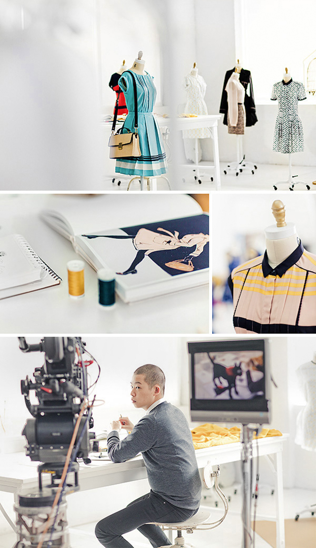
We had the honor and pleasure to capture behind the scenes production and set stills for Target via Little & Company last fall in Brooklyn, NY.  The project entailed working closely around the production of a broadcast spot for the 2012 launch of the Jason Wu line of clothing for Target.

You may already know him from the world of fashion design, but the 26 year old's name was brought to the forefront after providing the First Lady, Michelle Obama with an original dress for the inauguration of President Obama.  Jason Wu's designs are one of the latest acquisitions for Target's clothing line and will be providing fashionable styles for purchase this Spring.

Film director Ellen Kuras and animation director Mark Gustafson were both on set for the project.  Their combined talents are very finely exhibited in the final spot which can be viewed via Target's YouTube Channel under "Jason Wu for Target."

Keep your eye out at Target for the latest trend setting designs by Jason Wu.  Thanks as always to Little & Company for bringing us on board for another exciting collaboration.