Close Map X

JCP Travel Map

Explore the work of Jonathan Chapman through featured locations.

Austin, TX for Land O’Lakes

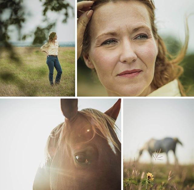
Imagery produced this past spring via Perkins+Will for Land O'Lakes.  The project took us to Austin, Texas; certainly a nice bonus as far as a location to travel to for a few days of production.  The sweeping vistas and rolling landscape, complete with horses, paired beautifully with our well cast talent.  Needless to say it was a hard project to call "wrap" and put the camera away.

Stay tuned for our next post, "Austin Street Portraits."  A personal project we stayed on in Austin a bit longer for, featuring black and white portraits of the faces of Austin's South Congress Avenue.

Designing Microsoft

A little over a year ago we were in Redmond, WA working on a series of interviews for the brand evolution of Microsoft and roll-out of Windows 8.  It didn't take long to realize we were filming and capturing responses from some of the top minds in the design and tech worlds.  We enjoyed every minute of the production and being allowed to see and hear what makes Microsoft a unique and vibrant Fortune 500 company.  The project was produced for the design firm Little with post-production by Splice.


Runyon Canyon, Los Angeles

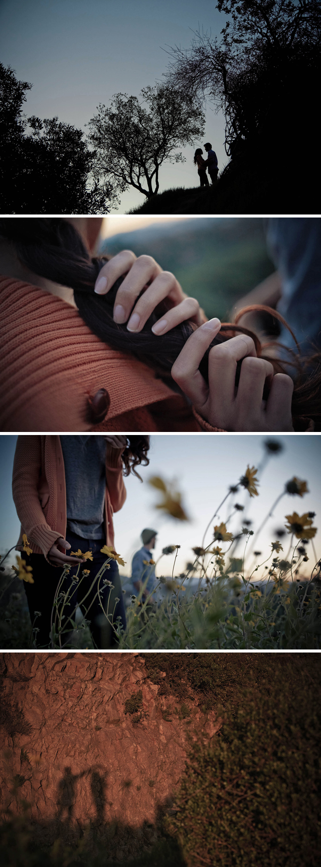
Our time in Los Angeles is always varied and it's certainly a city that inspires creativity and visual exploration. This series of images were shot this past Spring amid Los Angeles' Runyon Canyon and are part of a broader motion project that we will be releasing in days ahead. The project is personal in nature and while concepted in Minneapolis, we worked closely with our L.A. based producer to help coordinate logisitcs. Adding a bit more time on the front or back end of client based productions has always proved valuable for personal shooting in enviroments and markets such as this. We were fortunate to tap two rising models for the shoot. Their energy and enthusiasm for the project paired with the talents of our production crew allowed for a great morning of shooting. 

Stay tuned for a forthcoming motion edit that is in the works, currently titled "Memory." A broader selection of stills from this shoot are available via the Projects section of our site.

HWY 1 - Bixby Bridge

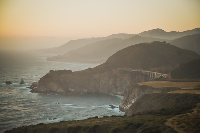
Continuing on the previous post, a view of Bixby Bridge just before sundown along coastal HWY 1.  South of Carmel and north of Big Sur, the bridge opened in 1931 after 18 years of construction.

HWY 1 - Refugio Beach

The first of several posts highlighting personal work from a recent 10 day road trip along historic HWY 1, Los Angeles to San Francisco.

Summertime

"If you're not barefoot, you're overdressed."  Unknown

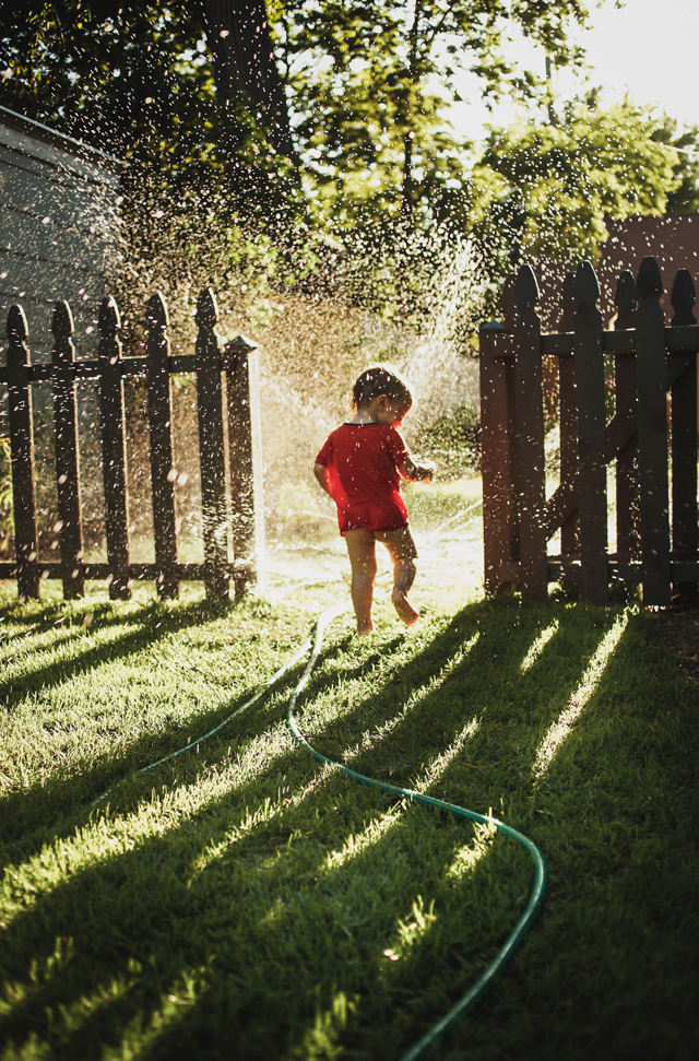
A little something from the archives to officially kick-off summer, my son Wesley enjoying a sun-filled soak.

Samsung - Director’s Cut

If you remember back to last month's posting "Samsung - Los Angeles" we shared a selection of stills from our time working on the campaign near the end of last year out in L.A.  The campaign was led by Turner Duckworth of San Fransico.  As has become commonplace for many of our productions we captured video along with stills for each of the scenarios.  We brought on LA based DP Patrick Lawler and AC Rich Hawkinson to shoot the video portion of the shoot.  We're constantly refining our process of capturing both still and motion and this was a really great experience in terms of teaming up with talent that was new to the JCP team.  The director's cut was culled and edited by Nathaniel Schmidt here in Minneapolis.  Take a moment and enjoy our latest motion release highlighting "Moments of Discovery," for Samsung.  Keep an eye out for a "Behind the Lens" video highlighting life on-set, behind the scenes of this production.


PDN 2013 Photo Annual

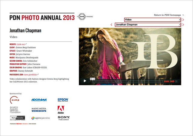
We're pretty psyched to have received word that our short film produced for Emma Berg made it into the Photo District New's 2013 Photo Annual.  Take a look at the project as well as take in some of the other amazing 2013 award winning work in categories such as Advertising, Magazine, Personal, Photo Books, Video, and Websites.


A Fresh Look, The JCP Rebrand

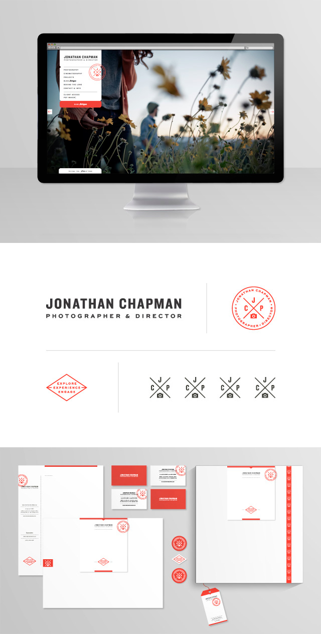
It's been a bit quiet on our end in terms of social engagement, however, we've been feverishly working between projects on a substantial update to the JCP brand.  A brand says as much about what you do and who you are as it does about where you are going.  We're quite excited and proud of where the business has taken us and we certainly feel the same in regard to where it is headed.  The brand here at JCP has gone through several iterations over the years; some minor and others quite extensive.  At the helm from the very beginning, Nathan Strandberg of EightHourDay has been instrumental in creating a cohesive and timely look based on his wealth of experience and superb sense of design.  With much of the heavy lifting over with, we are excited to present a revised and refreshed brand that will serve JCP for years to come.  Among the various areas that have received attention, we are looking forward to the new look of the printed matter as well as new additions to the website and blog.  Everything visible on the new site is easily accessible for updates and changes on the backend thanks to the new interface built by John Peacock and crew at Clear Minneapolis

Along with the new look of the blog we thought it would be a nice change to feature a Q and A session we had with the designer Nathan Strandberg.  It's a unique insight into the design world and a look at the process itself of working on a rebrand. 

Q.  In your opinion what is the overall importance of refreshing a brand?

A.  Often times, I feel like a great brand refresh can refuel a company and it’s crew. The (re)branding process provides an opportunity to step back and examine who you are as a collective and where you want to go. The end result is something that everyone can have stake in and be excited to share.

Q.  Describe your approach to the process of starting a rebrand?  What are the initial steps you take in your approach to rebranding? 

A.  With any branding project, whether it’s a new business or existing one, we like to begin a visual dialog with our clients. The goal is to capture the essence of their business through discernible styles of typography, illustration, photography, color palettes and iconography. It’s these mood boards that really develop the definitive character of a company.

Q.  In addition to design can you tell me about the importance of working with a code developer for the website? 

A. When it comes to implementing a website, a skilled developer is huge! Many of times (in the distant past), we’ve taken on the coding task ourselves and have had to alter the design to fit our development know how—that’s no way to work. An accomplished developer brings to the table knowledge we don’t have and a fresh perspective on navigating the web.

Q. How do you manage to stay both personal and original in your creative approach to a brand refresh? 

A.  It all comes back around to those initial steps and the visual dialog. If done well, we can really capture the essence of a company. It’s that genuine feel and transparency that makes a brand strong. The originality is just a natural extension of building that personality. Every business, just like every person, is unique.

Q.  Are there influences in your life that help drive the direction of your design?

A.  Definitely. It’s something that’s been evolving since I was a kid. The original spark was the subcultures of skateboarding, snowboarding and music—I loved the individuality and that idea of infinite possibilities. As time goes on It’s been the people I meet that are telling amazing visual stories. Everything’s amazing these days and the result is an unlimited source of inspiration.

Q. What inspires you the most when developing a new direction for a brand?

A.  I love keeping up with graphic trends but then balancing that with a strong concept and the true personality of a brand. If done right, the result is an energetic feel with some good staying power.

Q.  Do you find it challenging to tie everything together once an initial design is formulated?

A.  On the contrary, if the core brand elements are thoughtful, rolling it out should feel really natural.

We hope you enjoy the new face of JCP.  It's been quite an adventure leading up to this date and we're psyched to be rolling things out!
Samsung - Los Angeles

"As one went to Europe to see the living past, so one must visit Southern California to observe the future."  Alison Lurie

Last October our creative efforts were concentrated in the greater Los Angeles area creating new content for Samsung via San Francisco based Turner Duckworth.  The project was one of the biggest to date, and launched us into the familiar world of product, people and environments swirling together to create authentic lifestyle moments between people and products for the campaign.

The crew was sizeable for a project of this magnitude and inevitably there were a lot of moving parts to coordinate.  We were fortunate to have everyone focused on their own section of the greater whole to come together as one cohesive unit producing a fine collection of still imagery.  With any project, big or small, it's always important to have the right people in place to help bring every detail to life.  One of the main themes for this shoot was "moments of discovery" in which we were exploring the reactions to situations and product within an environment.  It's always a challenge to capture just the right look but from the final imagery and the comments from design director - Brian Steele, I would like to think we gave it our all and then some.

Constantly thinking of ways to make any shot better, Jonathan embraces collaboration. He has a great understanding of when to abandon an angle or setup, and when to mine deeper to achieve the best possible results. With a great feeling for light and composition, he has an uncanny knack for pulling an honest moment out of a staged scenario.

Brian Steele
Re: Samsung production (photography / cinematography)
Design Director - Turner Duckworth